ShopDreamUp AI ArtDreamUp
Deviation Actions


Suggested Deviants


Suggested Collections


You Might Like…


Featured in Groups


Description
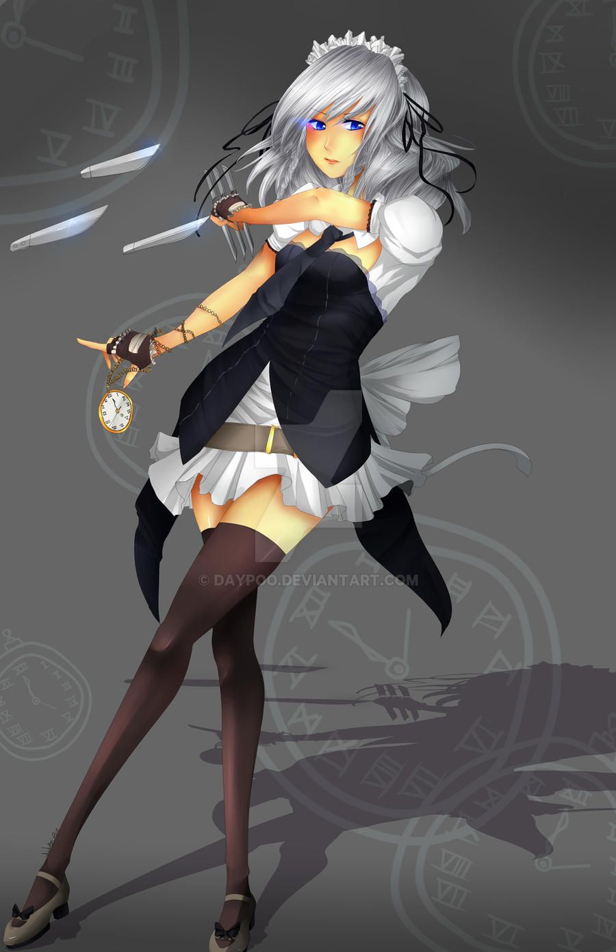
I had this done yesterday.. Just thought I'd spam uploads today a bit with whatever I got done in the last 2 weeks.
I got Keine coming along soon toooooo ~

Enjoy!
Finally done thoughh amg yes.
You'll see this at Animethon 2012, if you're there!")
- This is not the full sized image. c:
I'm also entering this into a contest for dressing the characters up in steampunk ahaha;; Hence her different outfit * A *
I got Keine coming along soon toooooo ~
Enjoy!
Finally done thoughh amg yes.
You'll see this at Animethon 2012, if you're there!
- This is not the full sized image. c:
I'm also entering this into a contest for dressing the characters up in steampunk ahaha;; Hence her different outfit * A *
Image size
3300x5100px 3.04 MB
Comments41
Join the community to add your comment. Already a deviant? Log In
first off, great work with the coloring..looks very nice and clean, and very even throughout the whole character..<img src="e.deviantart.net/emoticons/s/s…" width="15" height="15" alt="
the very first thing that i noticed is her arm(the one holding, knives?) it seems too small and thin..then the three knives that she's dodging, i think it would have looked better if it was closer to her, so that it looks like her enemy is a really good shot, like it almost hit her but she's just faster and better than her enemy..<img src="e.deviantart.net/emoticons/s/s…" width="15" height="15" alt="
these are just from my point of view..i'm not an expert as well, i just thought i'd give a comment and help out a fellow artist improve..<img src="e.deviantart.net/emoticons/s/s…" width="15" height="15" alt="